Why Some Blogs Get Read—and Others Get Abandoned
Why the Time Readers Spend Matters

A browser tab opens. A few scrolls later, a finger quietly taps the back button.
We often dismiss that brief moment with a shrug: “I guess it just wasn’t their thing.”
But those few seconds may have had less to do with personal taste than with the way the page was designed.
Google has a name for what happens in those few seconds.
Dwell time: the amount of time it takes someone who clicked a search result to return to the search results.
Google has never fully disclosed exactly how it uses this metric. However, a large-scale ranking correlation study by SEO firm Moz found a clear relationship between dwell time and Google search rankings.
In other words, pages that hold readers’ attention longer are more likely to rank near the top of search results.
What’s interesting, though, is that keeping readers around doesn’t necessarily require a mountain of information.
The 260% Difference One Video Made
Video marketing platform Wistia ran a remarkably simple experiment on its blog.
It added just one video to an existing post. The result: a 260% increase in time on page.
A single “visual element” created a difference of nearly three times—not a change in the content’s logic or the amount of information it contained.
That wasn’t a fluke.
People respond far more immediately to images than they do to written sentences.
Text has to be interpreted. An image can often be understood on the spot.
That’s why an image placed between paragraphs gives readers a brief moment to reset before deciding whether to continue to the next one.
Writing without a pause for breath feels exhausting—and when readers feel out of breath, they leave.
The 94% Difference One Photo Made
According to data compiled by marketing consultant Jeff Bullas, posts that included images received 94% more total views on average than posts without them.
That’s a difference of almost two to one.

A study by Blog Pros, which has analyzed blog performance, also found that blogs ranking near the top of search results tended to place an image roughly every 350 words.
Look at the numbers alone, and the takeaway might seem to be: “Just add more images.” But there’s an important qualification. Not all images have the same effect.
A Slow-Loading Image Can Be Worse Than No Image at All
An experiment by user-experience research firm Nielsen Norman Group illustrates the point precisely.
When the same image took eight seconds to load, users looked at it for just 1% of their total time on the page.
When the image loaded quickly, however, the time users spent looking at it rose to 20%. That’s a twentyfold difference.
In other words, an image doesn’t increase dwell time simply by being there.
It needs to be lightweight, quick to load and woven naturally into the rhythm of the writing.
Forcing a large, heavy photo into a page can actually drive readers away from the very paragraph it was meant to support.
Persuasion Starts with the Senses, Before Logic
Another interesting finding came from research conducted jointly by the University of Minnesota and 3M.
Presentations containing visual elements were 43% more effective at persuading audiences than presentations made up of text alone.
Even when the logic is flawless, it is the senses that open people’s minds before they reach the argument itself.
The same is true of blogs.
No matter how accurate the information may be, if readers leave the page before they reach it, that information might as well not exist.
That is ultimately what the dwell-time metric tells us.
Good Writing Doesn’t Begin with Information. It Begins with Rhythm.
That’s Why Decoblux Was Needed
If we had to sum up all the data so far in one sentence, it would be this: what keeps people on a page is not dense information, but a light, sensory rhythm.
But that rhythm can’t be created with just any image.
Stock photos can feel impersonal, while oversized original images lose readers during loading. More importantly,
a photograph can convey information, but not necessarily emotion. The only thing that can smile, react with surprise or nod along between sentences is a character—lightweight, fast and brought to life by a human touch.
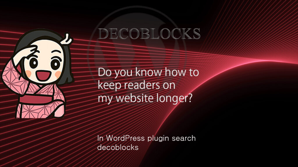
Decoblux is the service that began precisely at this point.
A character sticker placed between paragraphs, in that brief moment when readers pause for breath. An image refined to sit lightly anywhere in WordPress. Above all, something that builds dwell time through expression rather than data. A good article is no longer complete simply because it is well written.
Only when it gives readers room to breathe can it truly become a piece they read to the end.
This article uses several Decoblux writing tools to demonstrate the service’s range of features. For a visually consistent article, it is aesthetically effective to maintain a coherent composition across the tools you choose.