Emojis and stickers from an accessibility perspective: How do screen readers interpret them?
- Even if it is the same image, the way it is interpreted can be different.
- The reason why an emoji, which appears as a single line on the screen, sounds longer when played through a speaker.
- Emojis are automatically read, but this does not guarantee that their meaning will be conveyed correctly.
- Alternative text should be concise and written to accurately describe the content and function of the image.
- Accessibility-conscious article structure and DecoBlocks.
- The most common points where people get stuck when trying to fix things themselves.
- In my posts, what should be determined and how should it be determined?
- Frequently Asked Questions.
- WordPress-related plugins
On the screen, a smiling face is briefly visible. However, for a reader using a screen reader, that image may be heard as words of an entirely different length.
How should the emojis and character stickers embedded in WordPress be interpreted? How should these visually friendly elements be presented in an audio environment so that they can be conveyed without being burdensome?
Even if it is the same image, the way it is interpreted can be different.
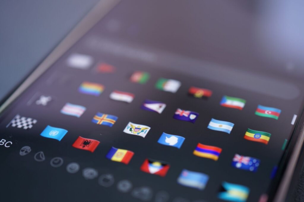
Emojis are often treated like characters. They are either characters included in a character system called Unicode, or they are processed as combinations of multiple characters.
Unicode provides each emoji with a short name and a search term. While these names can be converted to speech, the actual display may vary depending on the user’s language settings and device environment.
On the other hand, character stickers are typically images. Screen readers do not directly display the characters within the image; instead, they read the alternative text associated with the image or the accessible name provided.
Emojis are closer to characters that are automatically interpreted. Stickers are closer to images that require the operator to determine the name to be read aloud.
Even with the same image, the results can be different.
The reason why an emoji, which appears as a single line on the screen, sounds longer when played through a speaker.
Let’s consider a reader who is reading a blog post and encounters multiple emojis. While the reader’s eyes might perceive five smiling faces at once, a screen reader can read them sequentially.
The public issue related to the NVDA project addressed the problem of repeated emojis being read one by one, which resulted in lengthy speech output. This case, registered on July 11, 2018, demonstrates that repeated emojis, which may appear decorative, can pose a significant burden on readability in audio environments.
The W3C also explains that the basic name of an emoji may differ from the meaning intended by the writer. The writer may have used the emoji to convey the meaning of “it’s okay,” but the system can only transmit the name of the emoji’s shape through voice.
This is when the visible meaning and the heard meaning do not match.
So the blog operator finds themselves asking again, “Wouldn’t it be enough if it just looked pretty?”
Emojis are automatically read, but this does not guarantee that their meaning will be conveyed correctly.
In short, emojis can be interpreted and read aloud by devices and speech synthesizers, but character stickers essentially rely solely on alternative text.
It’s not enough for an emoji to simply be read.
The same emoji can be interpreted with different names depending on the user’s language and the implementation environment. When new emojis or combinations are added, the interpretation may also vary depending on the version.
Therefore, it is important to be cautious about relying on a single emoji to convey a necessary meaning in a sentence. Before choosing an emoji based on its appearance, one must first determine what meaning that element should convey to the reader.
If the default name of an emoji does not match the context, it is possible to directly define its role and name and provide an explanation. The W3C provides guidance on how to specify the role of the image and provide an accessible name in such cases.
Alternative text should be concise and written to accurately describe the content and function of the image.
The most important criterion for accessibility is whether emojis or stickers add information. Distinguish between those that simply decorate the screen, those that explain the content, and those that have clickable functions.
- Decorative: If it does not change the meaning of the main text, make sure it is not read aloud.
- Information: Briefly explains the meaning necessary for the context.
- Functionality: Describe the purpose of the button or link, not its appearance.
If the sticker is purely decorative, the alt text for the image can be left blank. This is because adding a description can cause screen readers to read unnecessary text, which can disrupt the flow of the main content.
The decorations should be quiet.
Conversely, for informational images, it is necessary to include a concise description of the key content. If the surrounding text already explains the same meaning, it is better to use an empty alt text to prevent redundant narration.
If a character is clickable, do not write “smiling character.” Instead, describe what that element does, such as “View comments” or “Go to the next post.”
Functional images prioritize purpose over appearance.
Accessibility-conscious article structure and DecoBlocks.
After checking accessibility, you can organize the visual flow of the content. DecoBlocks is a plugin for WordPress that allows you to add speech bubbles, boxes, emphasis, tables of contents, and decorative effects to your posts. You can use the Section Box (Solid) to group guidance or warning information, and the Divider Line – Solid to divide sections.
When inserting stickers, you can add character stickers from a sticker pack that was installed using the “Insert Character Sticker” function. However, the operator must separately determine whether a sticker is for decoration, informational purposes, or functional purposes, and the alternative text and accessible name must be set accordingly.
The most common points where people get stuck when trying to fix things themselves.
The actual problem occurs when inserting images into WordPress. It is easy to use file names as alternative text, or to provide lengthy descriptions of a character’s appearance, or to repeat the same phrases for decorative images.
Sentences that use multiple emojis to express emotion are more difficult. While they may appear cute on the screen, screen readers will read the same name repeatedly, which may require the reader to wait before they reach the actual text.
Sometimes, the cuteness can be a burden to read.
There are also limitations when verifying directly. Just because a sound plays normally on one computer does not guarantee that all visitors will hear the same sound.
The way it is read and displayed can vary depending on the combination of browser, operating system, screen reader, and speech synthesizer. If alternative text is omitted, some screen readers may read the file name.
Conversely, adding explanations to decorative stickers in the name of accessibility can make the reading process longer. A good explanation is not one that is overly verbose, but rather one that retains only the necessary information.
Automated inspection cannot determine the meaning itself.
If the automated inspection cannot determine the meaning, it is necessary to check the visual structure of the text and the meaning of the sentences separately. DecoBlocks’ Auto Table of Contents creates a table of contents based on the H2 and H3 headings of the post after it is published.
A table of contents can display the heading structure needed to understand the sections of a long document. Decorative elements such as tables of contents or boxes should not be used as substitutes for alternative text or accessible names, and their appropriateness should be determined separately.
In my posts, what should be determined and how should it be determined?
First, divide the emojis and stickers within the text into three categories. If they are decorative, do not have them read aloud; if they are informative, briefly describe the intended meaning; and if they are functional, describe what happens after they are clicked.
When using emojis to supplement emotions or states, consider the context rather than just the name of the shape. For example, if what the reader needs to understand is not “a smiling face” but “a feeling of celebration,” the meaning conveyed should be tailored accordingly.
It is safer to reduce repetition. Instead of repeatedly attaching the same emoji at the end of a sentence, it is clearer in a voice environment to express the necessary emotion or state with a short phrase.
The sentence is clearer than repetition.
After posting, listen to the actual reading using either NVDA or VoiceOver. Check whether the decorations pass by quietly, if the information makes sense, and if the buttons accurately reflect their purpose.
Ultimately, the criterion is not “whether it looks beautiful on the screen.” The criterion is “whether readers who cannot see the screen can still receive the same meaning and functionality.”
The same meaning and function are the key.
When using emojis and stickers, it is important to first determine the meaning and function that the reader should understand, rather than focusing solely on the visual decoration of the screen. Then, verify the reading using an actual screen reader, and visually organize only the necessary areas.
DecoBlocks allows users to add speech bubbles, boxes, tables of contents, dividers, and character stickers to WordPress posts, assisting with content organization. However, the determination of appropriate names and alternative text for each element must be performed directly by the administrator, based on the function of each element.
Frequently Asked Questions.
Q. How should I categorize and inspect emojis and stickers on my website?
A. First, categorize them into three types: decorative, informative, and functional.
For decorative elements, ensure they are not read aloud. For informational elements, provide concise descriptions of the necessary meaning. For functional elements, describe the actions that occur after a click. After publishing, verify the actual reading using NVDA or VoiceOver.
Q. Are the emojis in WordPress always read as the same word by screen readers?
A. No. The name and expression used may vary depending on the combination of language settings, browser, operating system, screen reader, and text-to-speech engine.
Q. Can this problem be easily solved using a tool? What kind of tool should be used?
A. It is possible to use accessibility testing tools and screen readers together. However, automated testing alone may not be sufficient to determine meaning in context, so it is safer to listen to the actual text being read aloud after it has been posted.
Q. What is the recommended way to present the structure of a long text after completing the accessibility check?
A. First, organize the heading levels and sentence flow, and then visually divide only the necessary sections.
DecoBlocks’s Auto Table of Contents feature generates a table of contents based on H2 and H3 headings after publication. The Section Box (Solid) feature displays related content within a box. Note that the table of contents and the boxes do not automatically provide names or alternative text for screen readers, so the meaning of images and functional elements must be checked separately.